UX Design Project
CampusHub
CampusHub, a mobile and web application, is a tool that streamlines the daily activities like grading, marking attendance, communication between student and faculty and more.
Introduction
Educational institutions struggle with non standard communication channels, manual administrative tasks, and disorganized classroom management, leading to missed announcements, limited student-faculty collaboration, communication gaps and overall a poor management system. To challenge is to come up with a solution that addresses different needs of educational institutions.
Project Type - Solo Passion Project
Duration - 1 month
My roles - User Research,
Research Synthesis, Ideation, Sitemap, UI Design
Research
From personal experience, I know that the day to day activities are not steamlined in an institutional setting. I wanted to understand how the people around me felt and wanted to gather their stories.
Survey
I sent out survey forms to understand what tools are being used
for different activities in different institutions. I gathered the
list of activities from personal experience.
Insights:
- Colleges on an average use 4 different tools for carrying out different tasks
- Inefficient usage of tools, juggling between multiple tools was very common
- Identified most commonly used tools by students and faculty
- Schools did not use too many tools because digitalization has not become a big part yet
Competitor Analysis
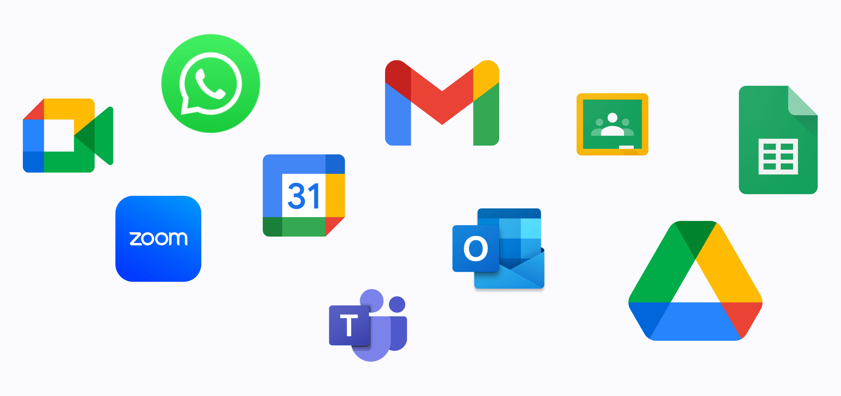
Based on survey response, I did an analysis on the most used tools
- MS Teams had the most features
- Google products had good cross app connectivity
- Whatsapp had the best chat related features
- Many colleges used private portals for sending out announcements
- Google classroom had good features, but I was able to think of many that could have been added
Observational Study
I observed how different activities are handled in my college
- Marking attendance takes time (class of 56 students).
- Assignment marks were shared publicly.
- Faculty did not inform students if there was going to be a delay or if they are not coming to class that day.
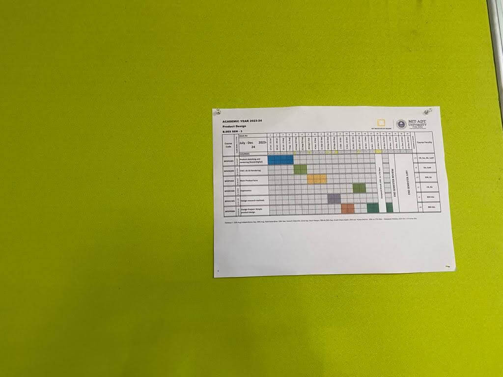
- Timetable was pinned on the bulletin board.
- Study resources (notes and stuff) were shared through WhatsApp or cloud links.
- Communication to students from faculty happened through class leader/ class representative.
- Submissions were done both online and offline.
- Students forgot deadlines and had to confirm with classmates.
- Late submission of assignments happened a lot - faculty did not track.
Interviews
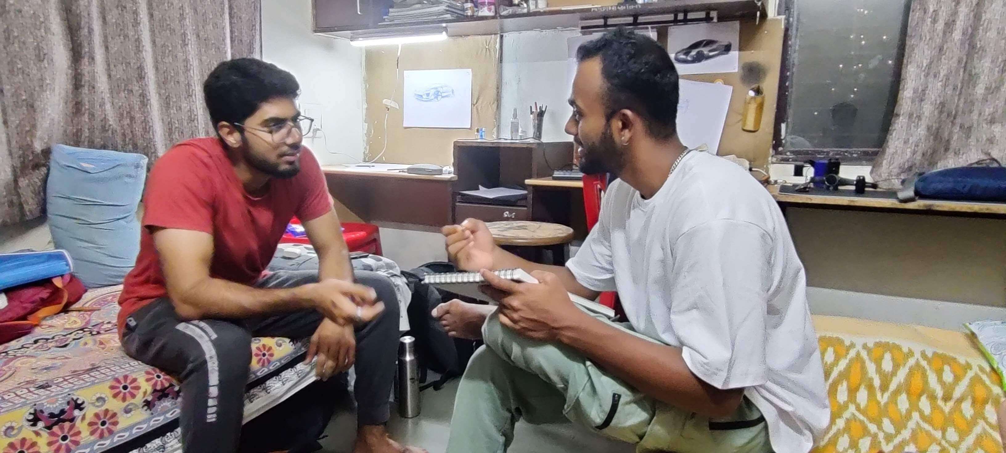
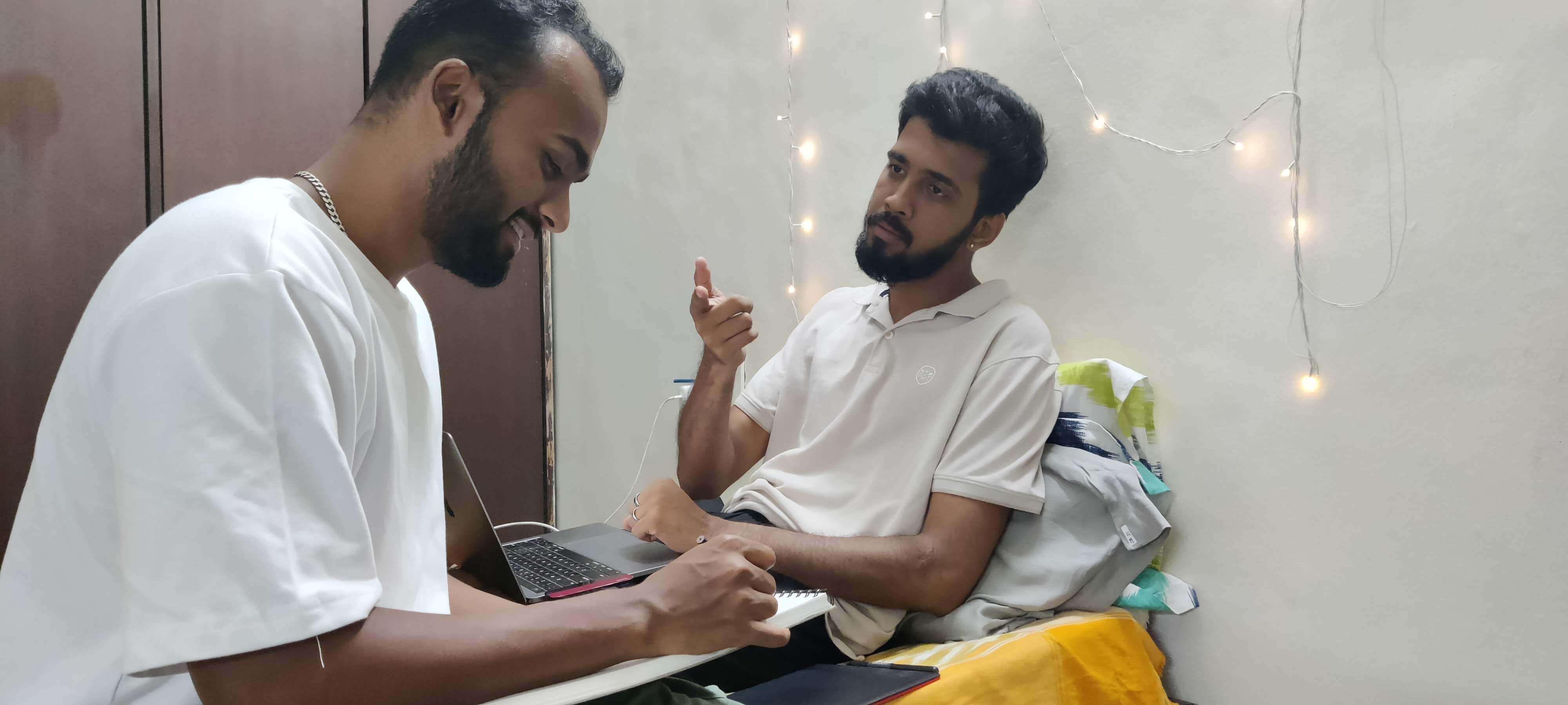
Participants: 7 students, 3 faculty - from different colleges and
schools
Important Insights - Faculty
- Students' messages get lost in WhatsApp chats.
- "Sometimes I forget deadlines myself because handling many subjects"
- Scheduling conflicts: "Sometimes I forget I have a meeting already and schedule another meeting"
- Assignments submissions came through different places like Gmail, drive, teams. Looking up previous work of students required a lot of searching.
- Not easy to let students know of any announcements like "I'll be late to class," "no class today," or "you can meet me at my cabin now."
- Grading students is a hassle; faculty have to consider internal marks so they have to look up old grades as well.
Important Insights - Students
- Miss out on important announcements because mail not checked regularly.
- Following class schedule.
- Remembering assignment deadlines.
- Checking attendance.
- Communicating with faculties - WhatsApp feels too informal.
- Sharing online submission with faculty.
- Too many tools, too many portals, too many accounts, too many passwords.
Data Synthesis
The following shows my synthesis of the gathered data
Problem Statement
In educational institutions, students and faculty face challenges in efficient communication, collaboration, and task management. The everyday activities that happen in an educational institution are not streamlined.
The 5 W's
- What - A solution that streamlines everyday activities in an institutional setting
- Who - Faculty, Students
- Why - To improve efficiency of communication, collaboration, task management, and other everyday activities.
- Where - Educational institutions
- When - During different activities like attendance marking, submitting assignments, grading assignments etc.
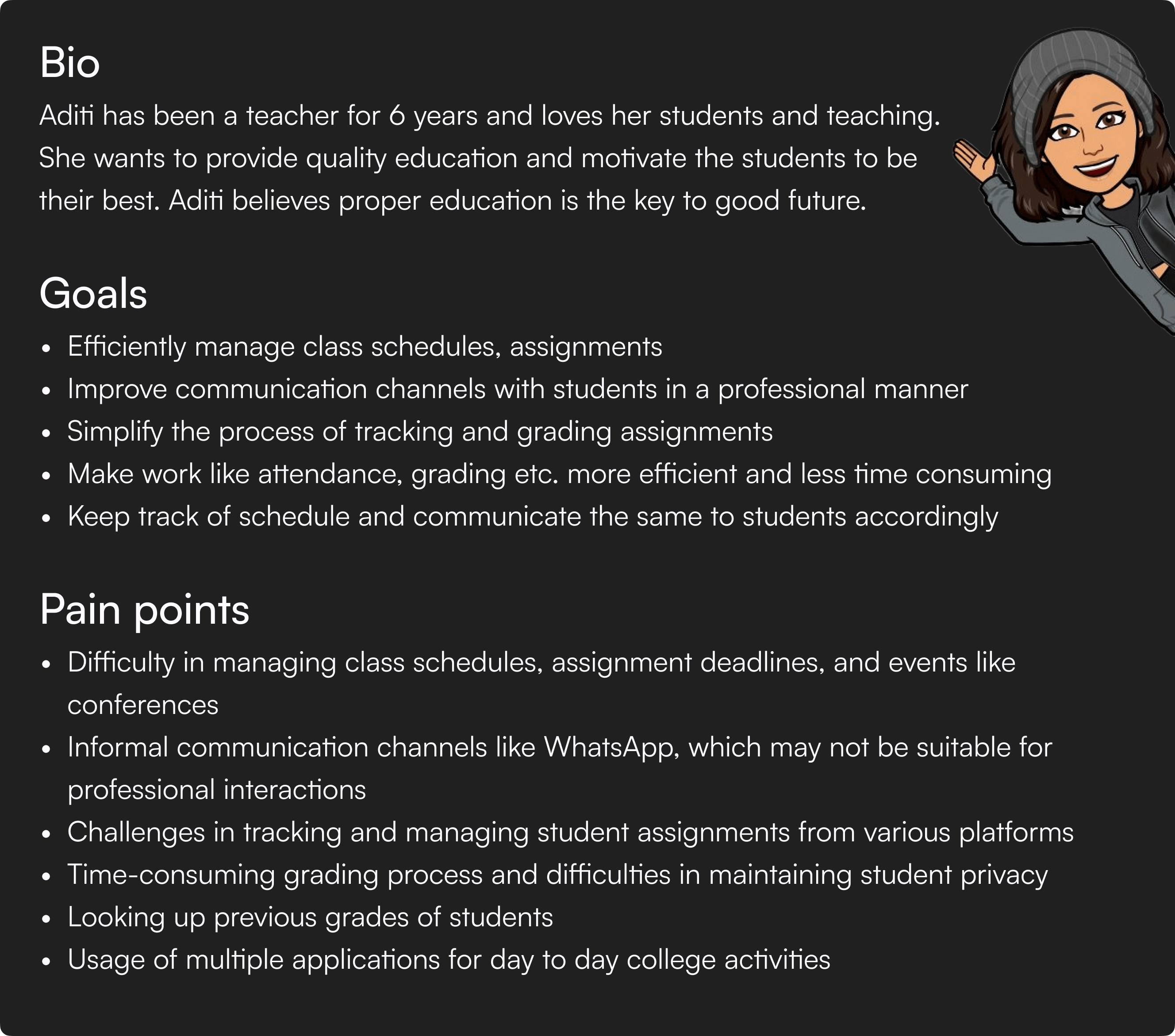
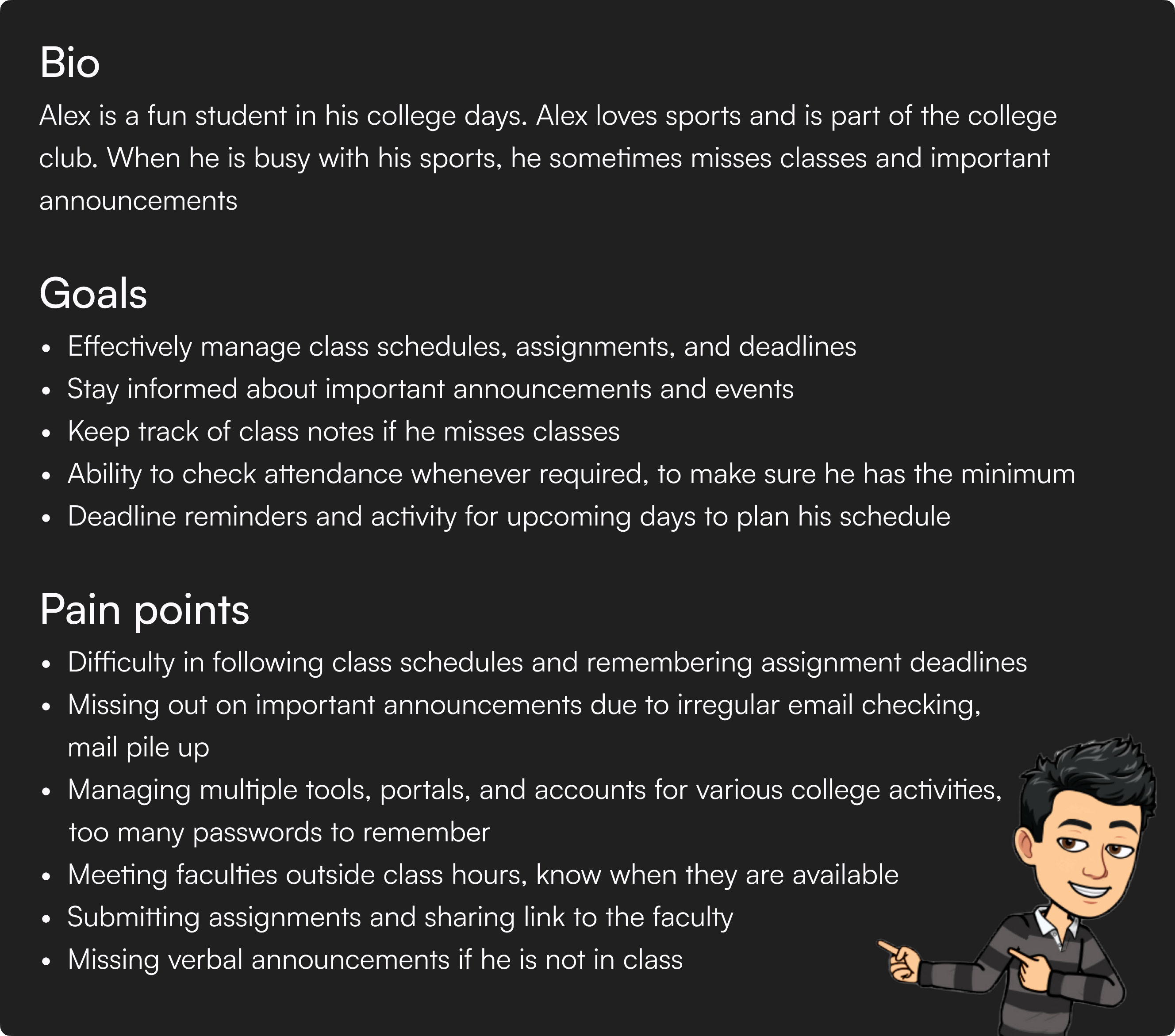
Persona
I use persona as a way to communicate goals and pain points of the user group
Faculty
Student
At this point, it was clear to me that a digital
intervention was required rather than any administrative changes
or any service intervention. To figure out if it was going to be
mobile app or desktop web app, I went back to students and faculty
to learn how they use mobile and desktop versions for different
tasks
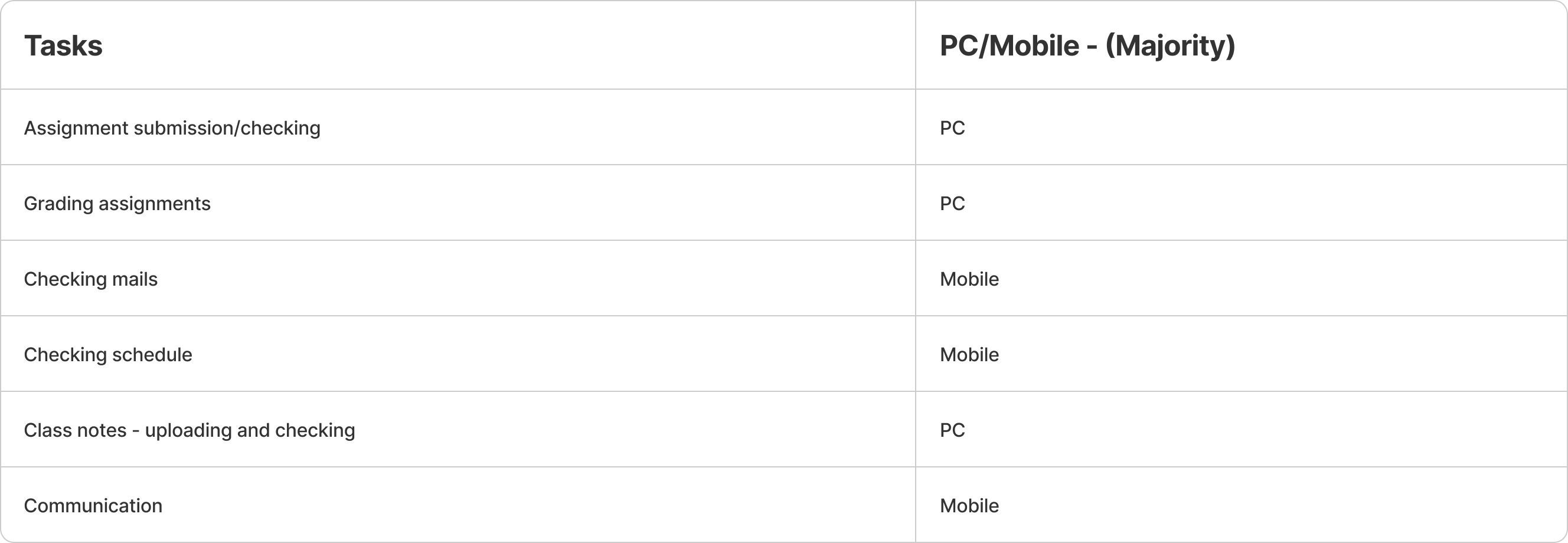
From this I understood that the output should be a integrated cross platform application
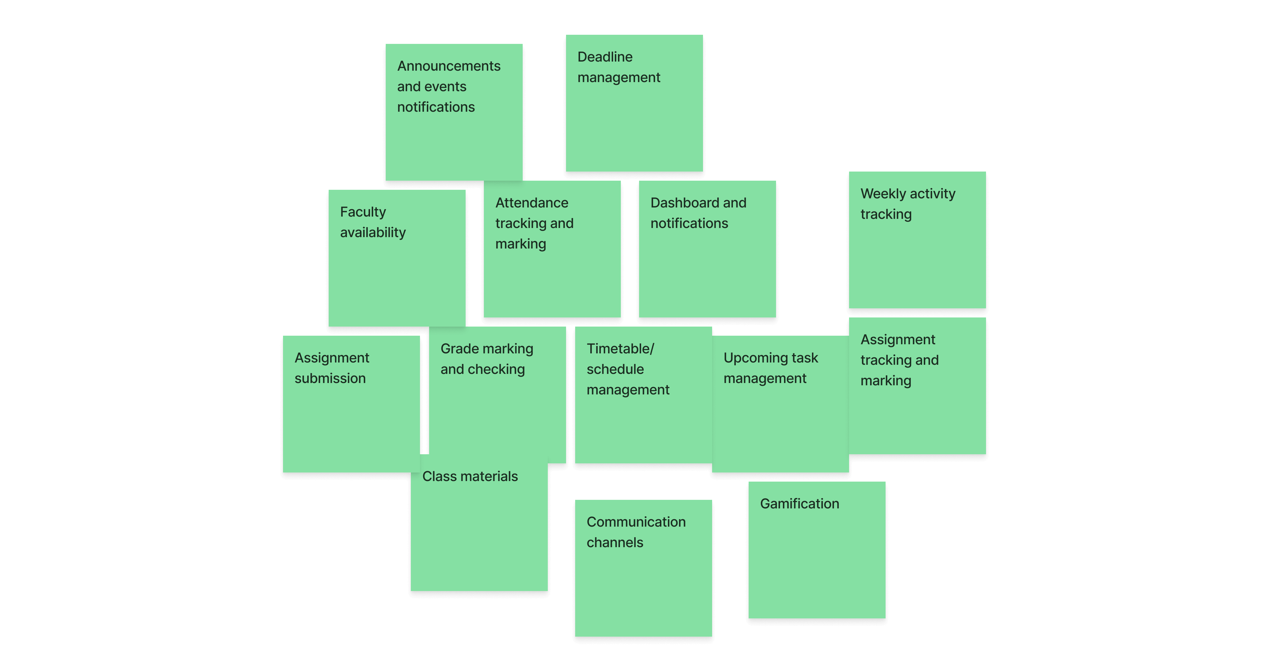
Ideation
I started out by noting the must have features that I gathered from my persona
Feature list
Based on the pain points gathered, I listed the must have features for my solution
Affinity Mapping of Brainstormed Ideas
I brainstormed how to implement the above must have features and jotted whatever came to mind on notes. Then I did an affinity mapping task to categorize all my cluttered ideas
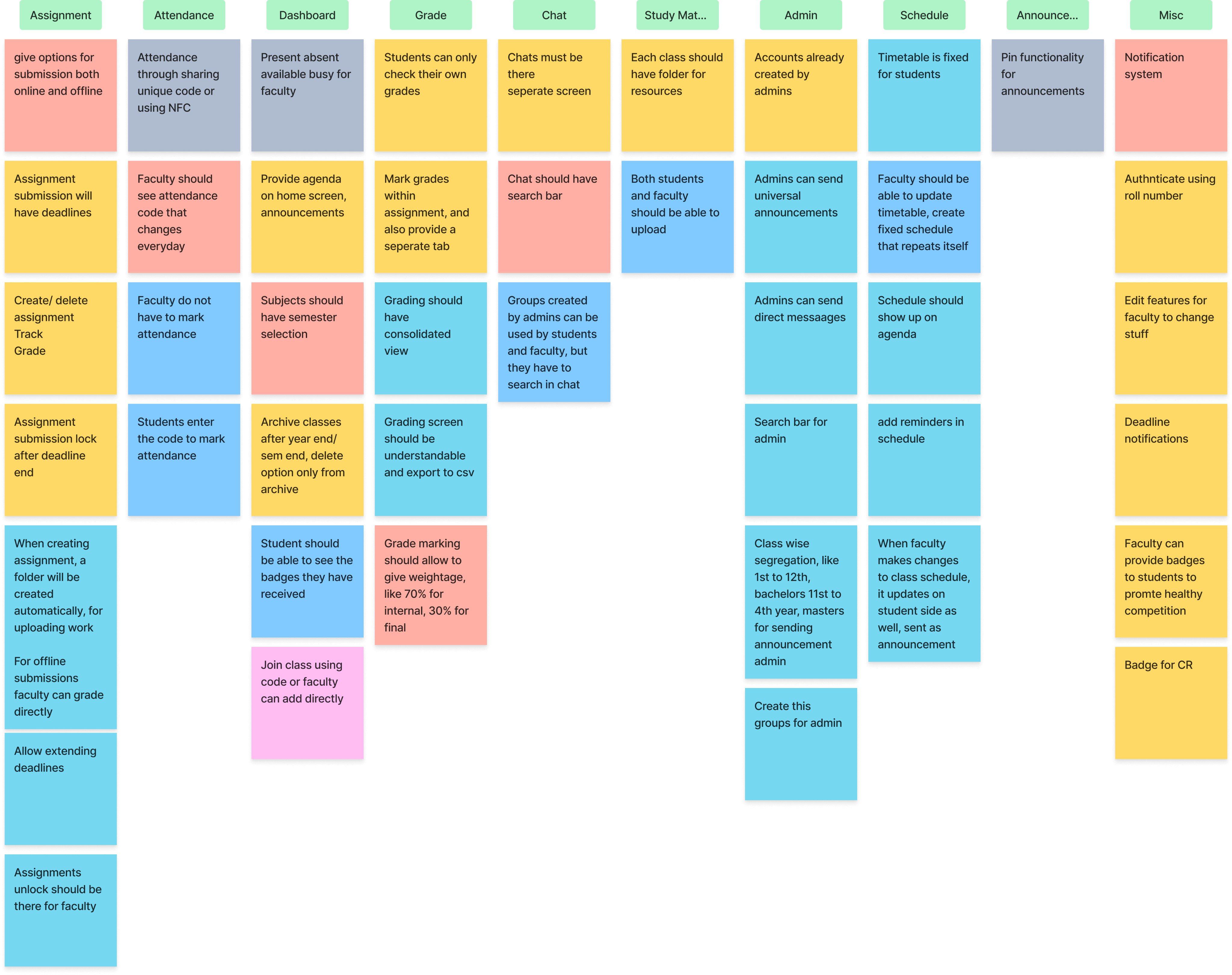
This activity gave me clarity on my app structure. There are different structures and permissions for different user groups
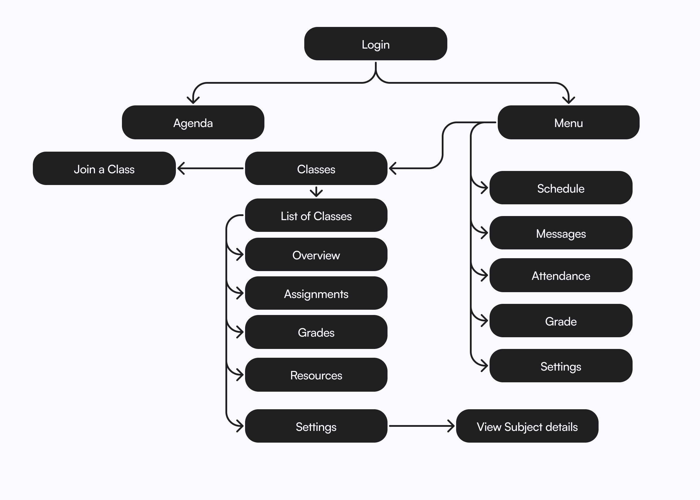
App Sitemap
Faculty
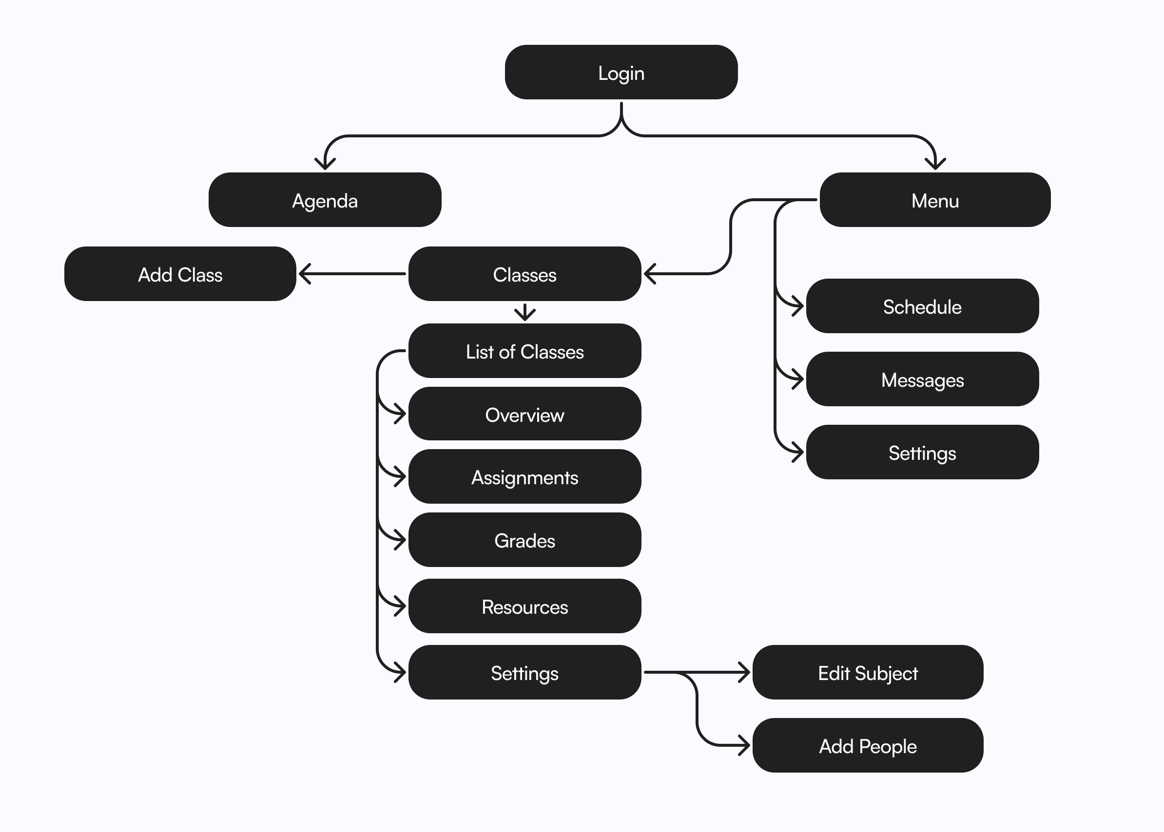
Student
Wireframing & Testing
The following wireframes are final ones that I made after two iterations of testing.
Testing Feedback
I presented few tasks to my users, and analysed their approach. Based on the analysis and feedback I gathered I came up with final wireframes
Iteration 1
- Class reps should be able to send announcements.
- Categorize home page into classes, announcements, assignments, etc.
- Do not put "add people" in settings, give a separate tab.
- Segregate home page into "today," "tomorrow," etc.
- Include quick links in the dashboard.
Iteration 2
- Add a "Delete" option to class settings.
- Include onboarding screens.
- Add a notification badge on the class to indicate the number of notifications inside.
- Create a profile section to view details like roll number, email, etc.
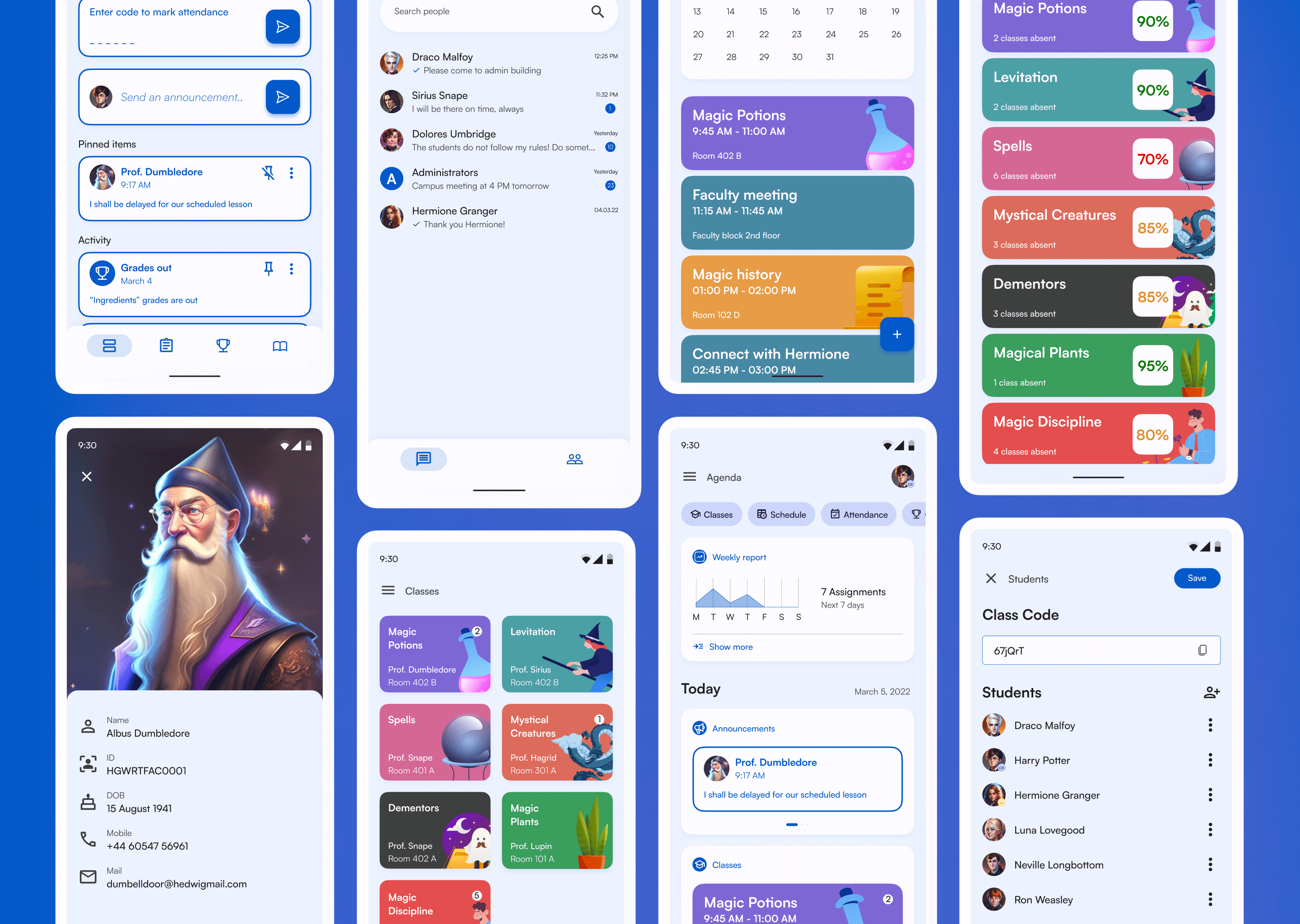
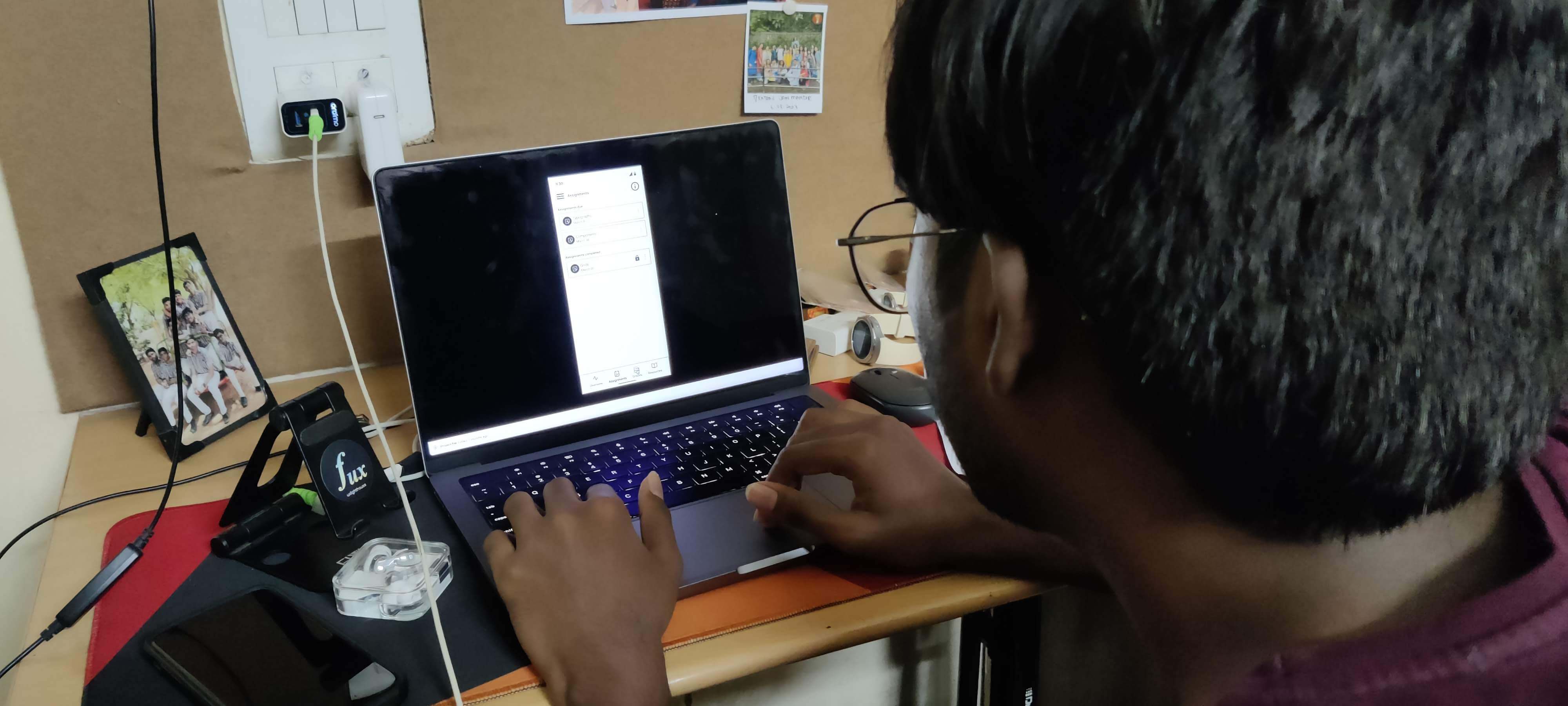
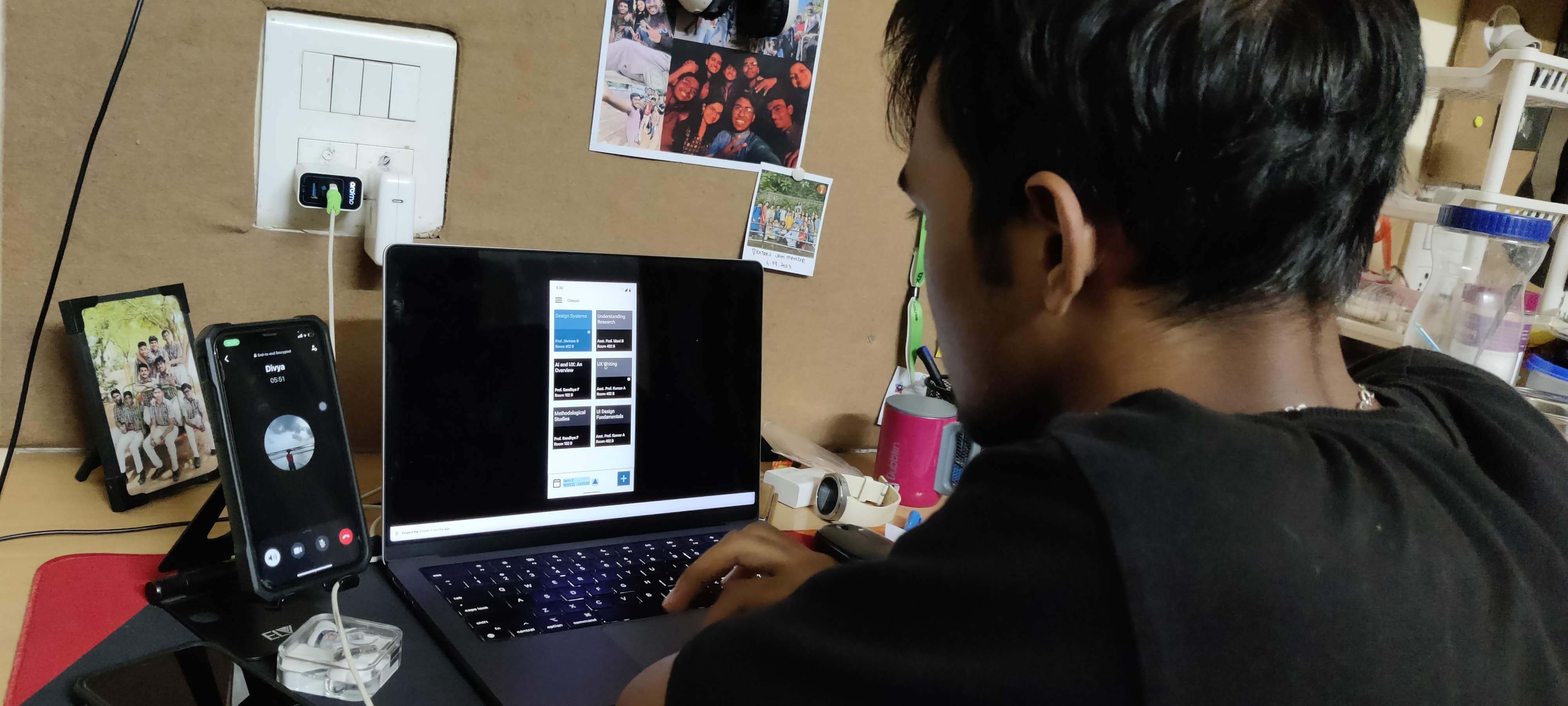
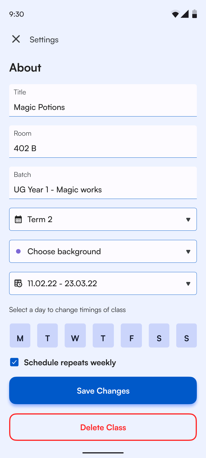
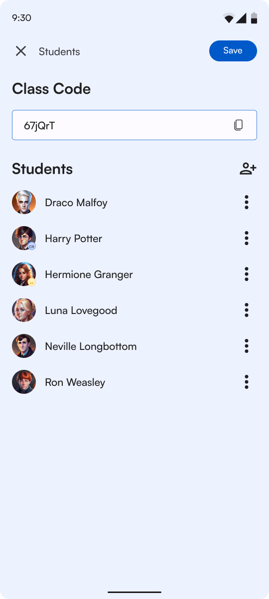
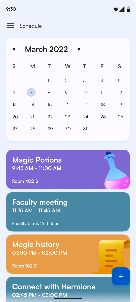
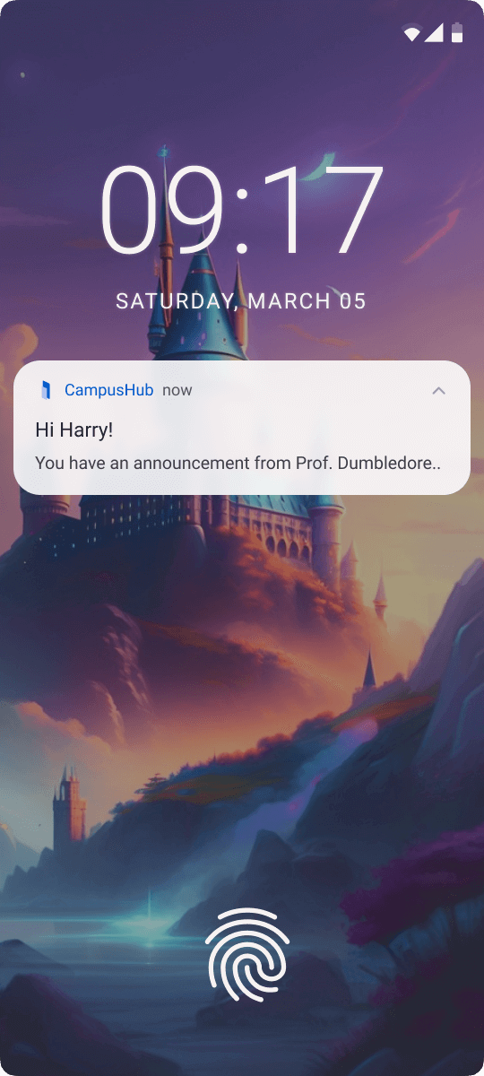
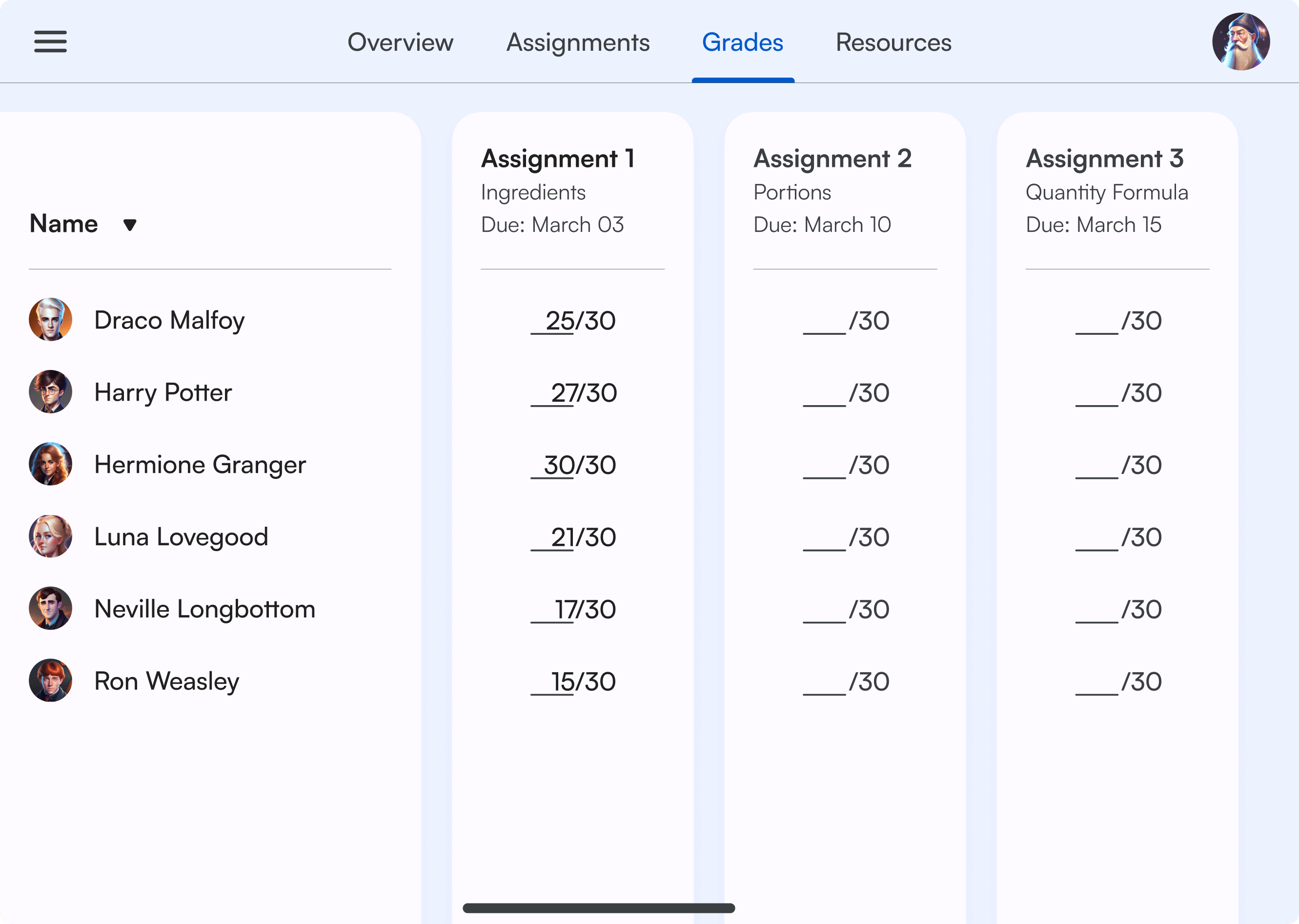
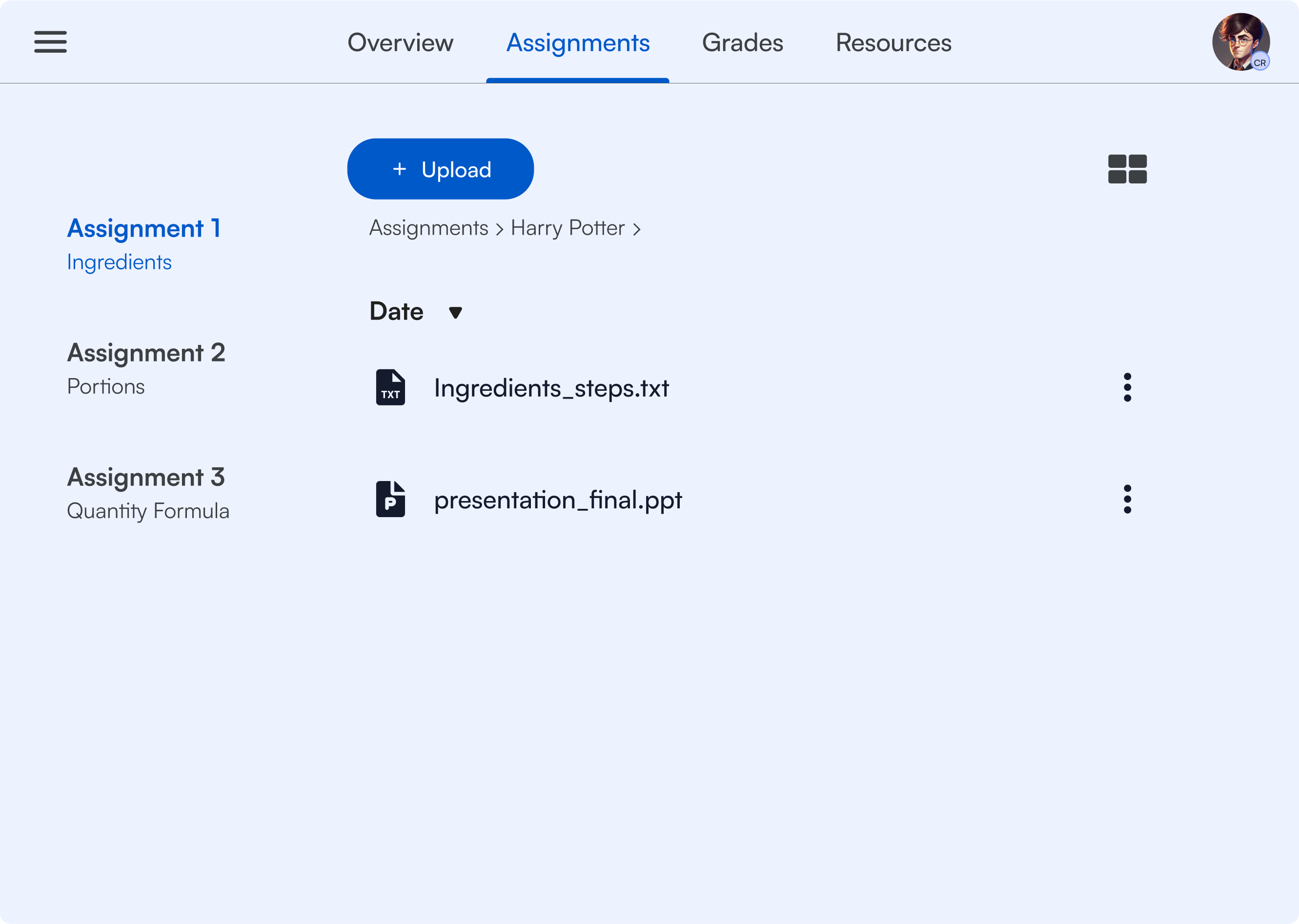
High Fidelity Screens
Check out the behance version of this case study to see my reasoning behind different elements of the UI(link provided below)
Student screens
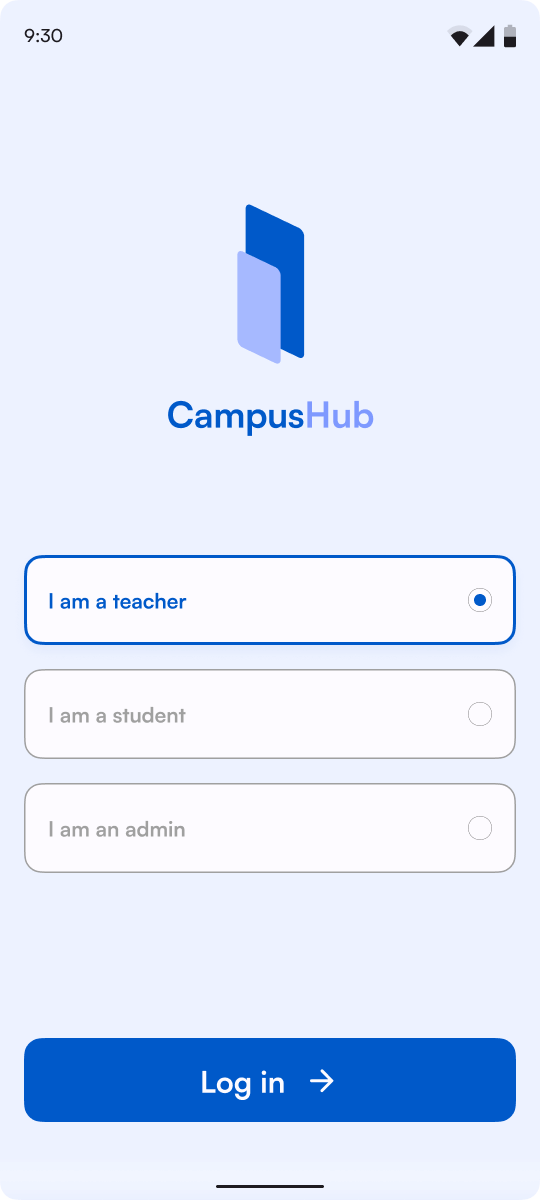
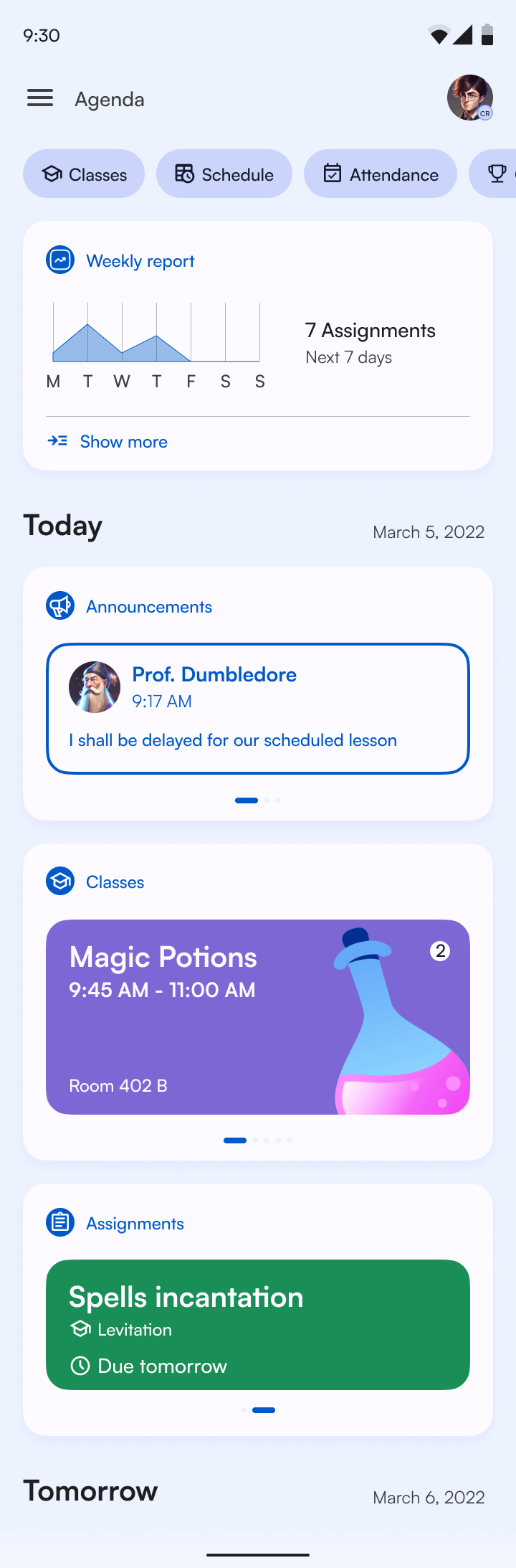

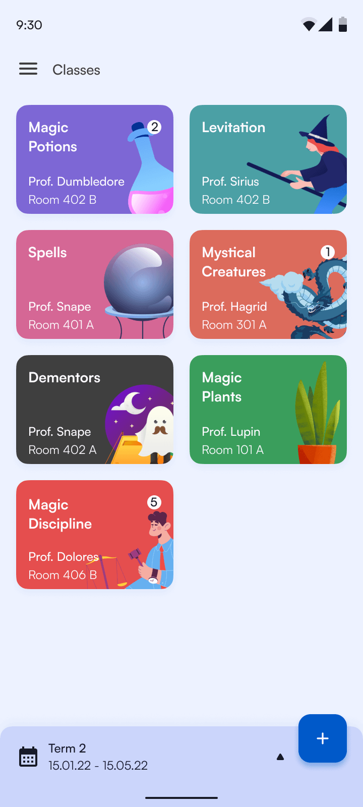
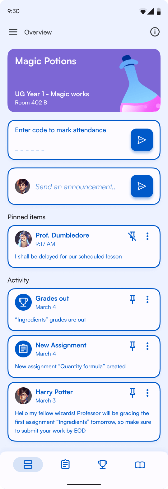
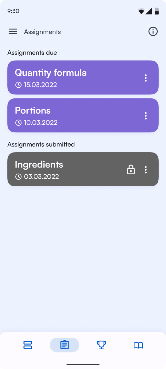
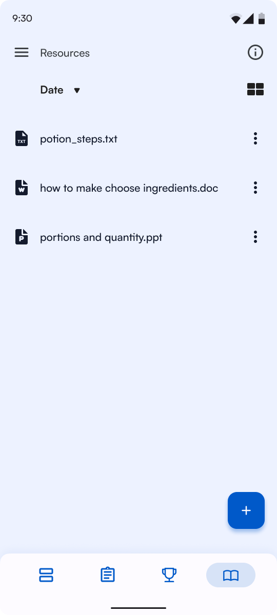
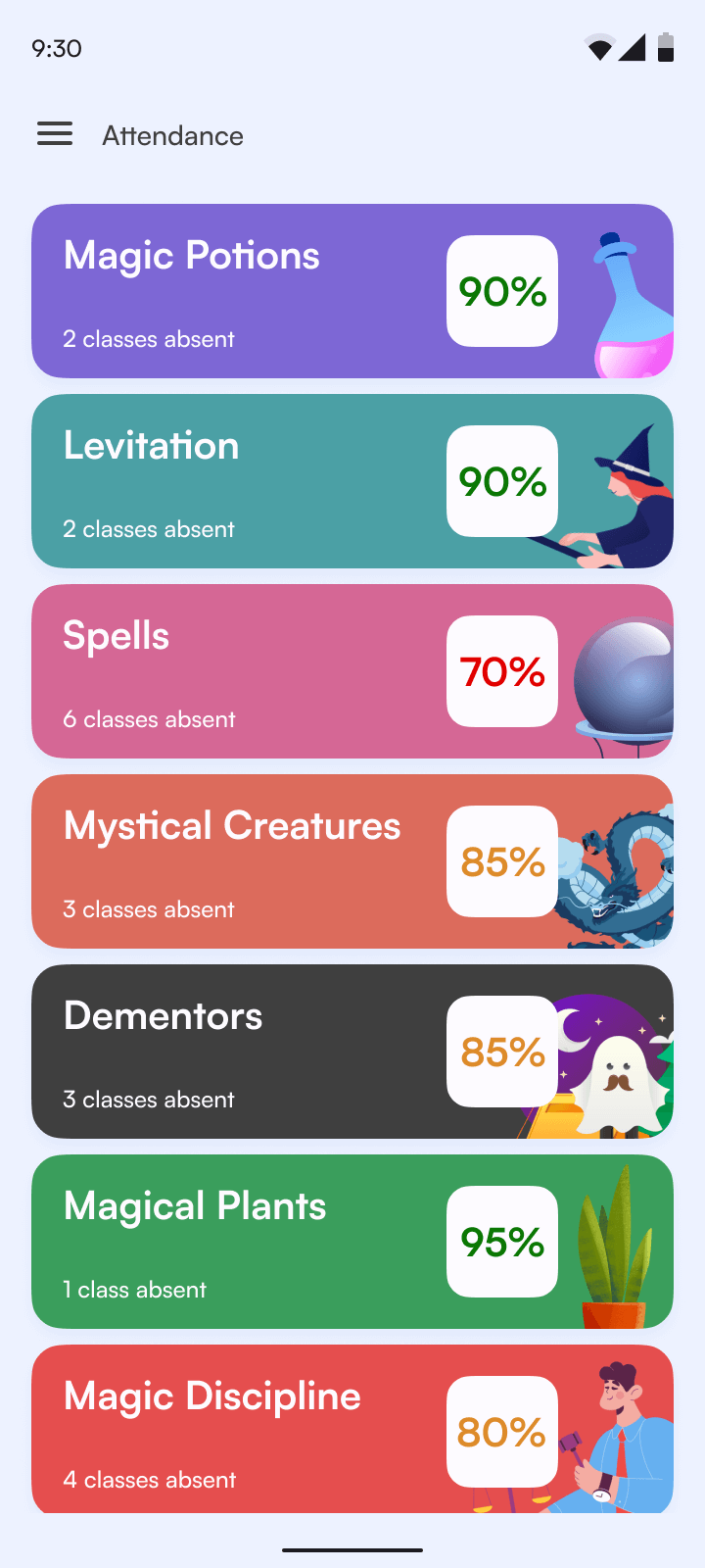
Faculty screens
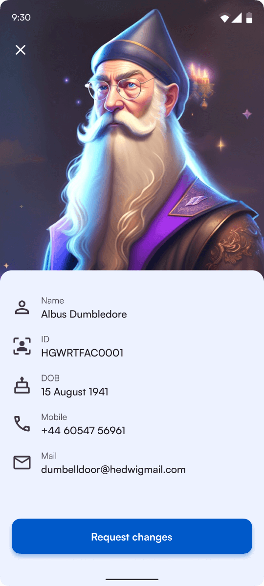
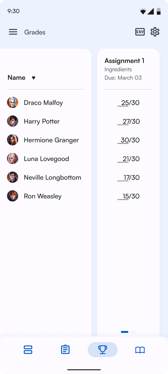
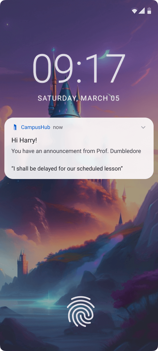
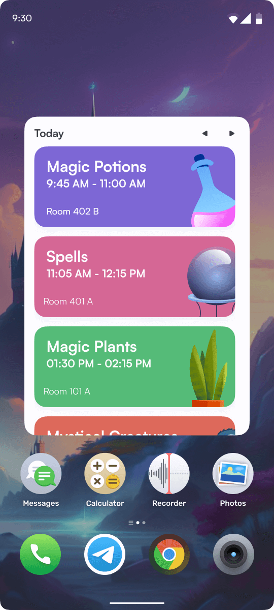
Notifications and Widgets
Desktop Screens
Thank You!
This was my first solo UX project.Through this project, I wanted
to learn different steps of the standard design process and learn
how design thinking works. I tried my nest to remove personal bias
while designing since I am a user of this solution myself. I made
sure the within the solution, typical everyday tasks were
addressed and seamlessly integrated.
I have a detailed story on how I approached my project, with
all the findings, missteps and learnings in the link below
Click here to read my detailed story on how I did this
project ⟶
More Projects
-
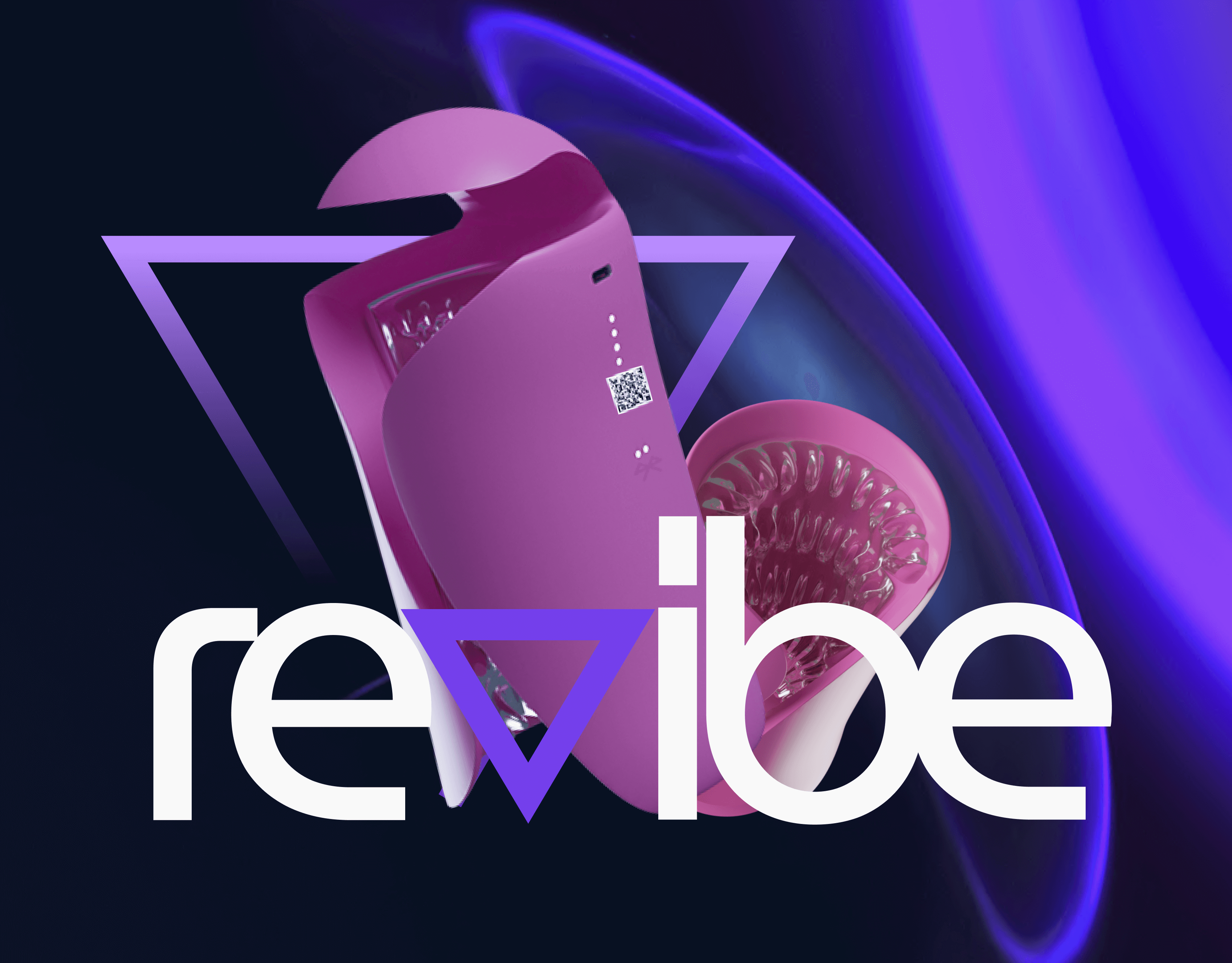 ReVibe
Group Project | SexTech | Design for special needs
Paraplegic penis owners often have trouble experiencing self pleasure. ReVibe is a mobile application-controlled sextoy specifically tailored for paraplegic penis owners. -
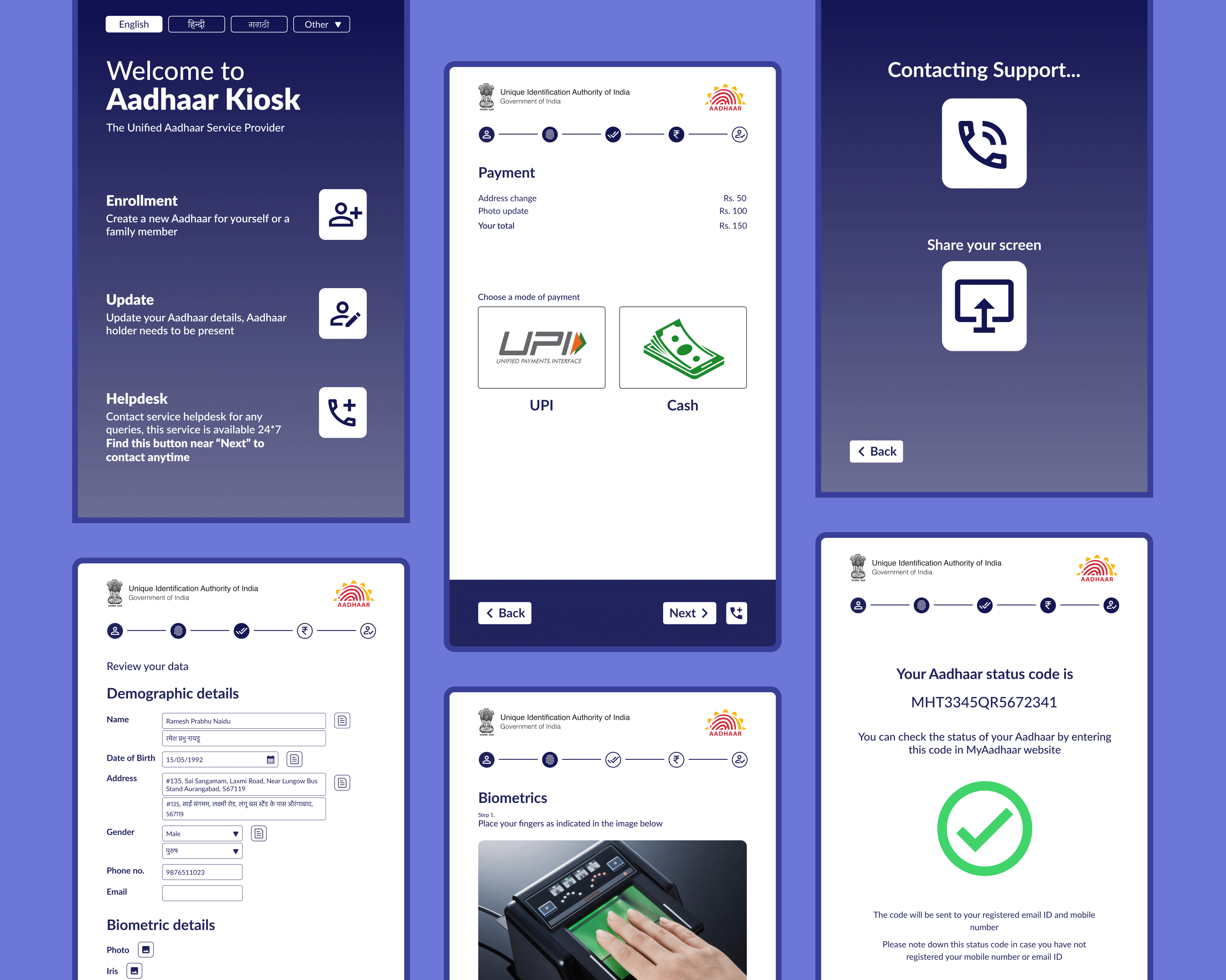 Aadhaar Kiosk
Group Project | Aadhaar ID | Design for accessibility
Aadhaar enrolment and update processes are slow and inefficient because they are done by visiting Aadhaar centers or banks with the help of a third party. Our Aadhaar kiosk design helps the users complete the Aadhaar processes by themselves.
